- I found an interesting dataset at https://www.cato.org/human-freedom-index/2021. This report is developed annually by the Cato Institute out of Washington, D.C with the Fraser Institute.
- This was how they described the 2021 report: “On a scale of 0 to 10, where 10 represents more freedom, the average human freedom rating for 165 jurisdictions in 2019 was 7.12. Among the 162 jurisdictions for which we have data for 2018 and 2019, the overall level of freedom (weighing all jurisdictions equally) remained unchanged, with 82 jurisdictions decreasing their ratings and 67 improving” (https://www.cato.org/human-freedom-index/2021). Whoever wrote the report and created the graphics on this page did a wonderful job, but I wanted to have a look at the data that lay behind their summary and perhaps compare it with past years.
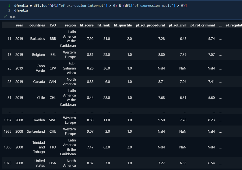
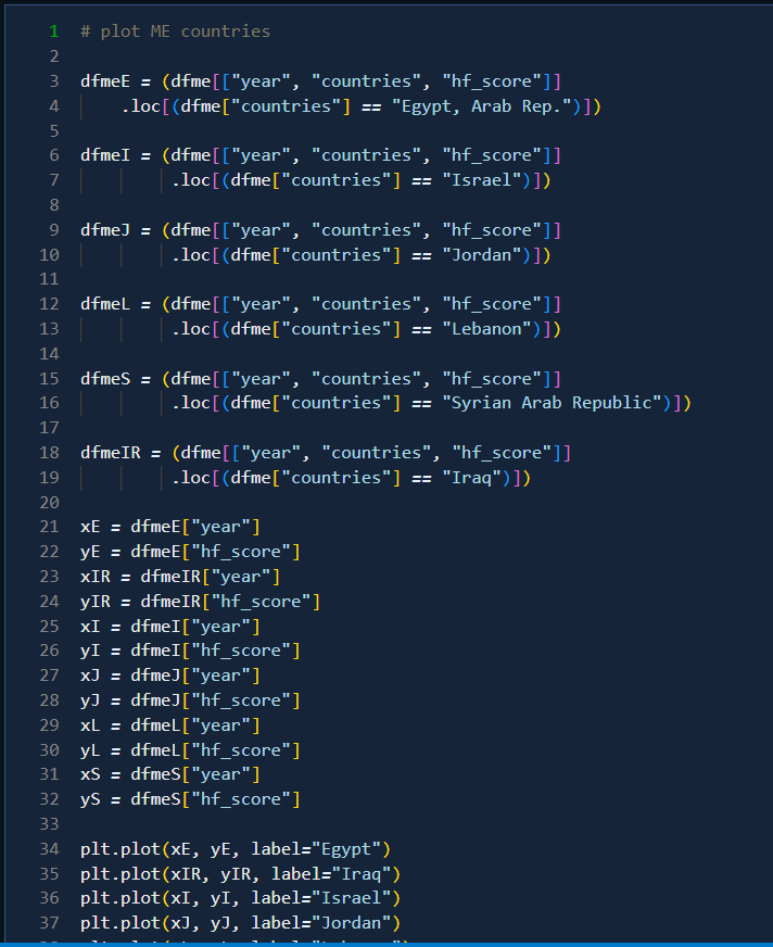
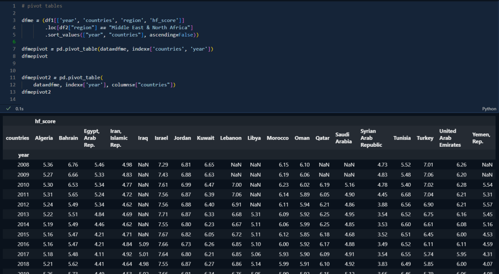
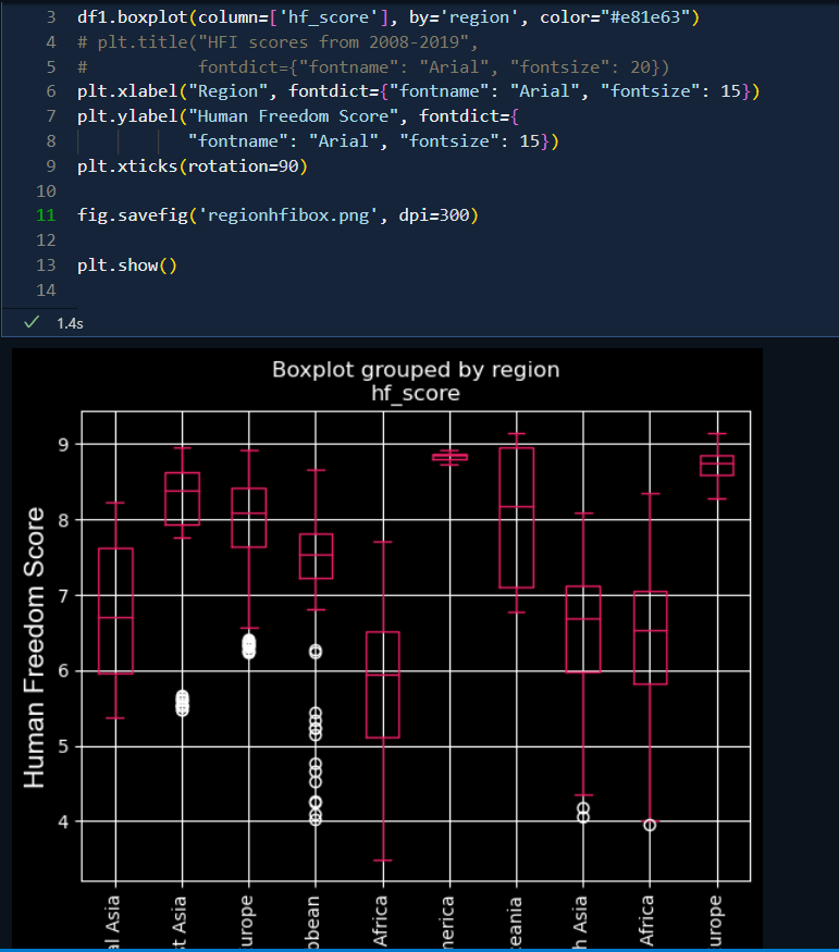
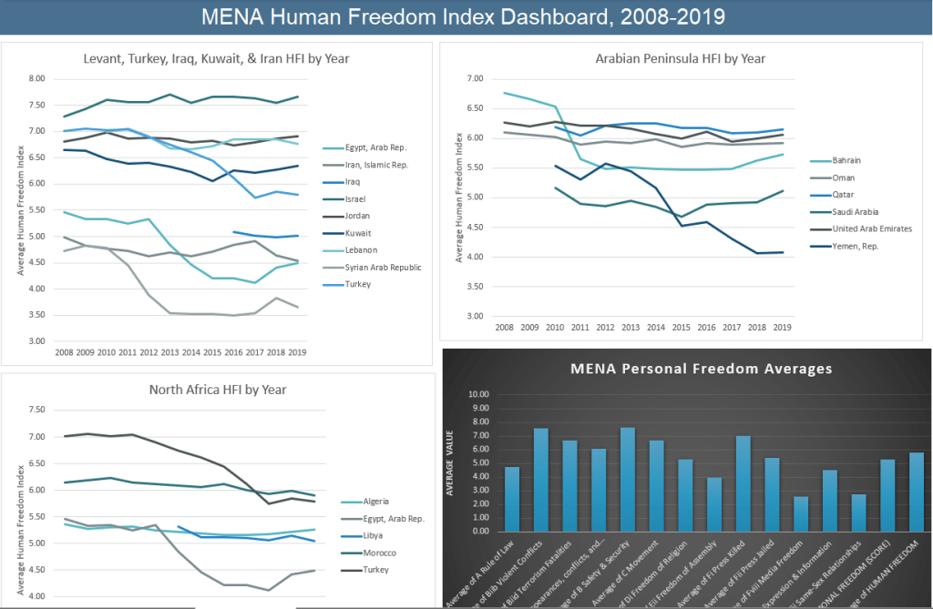
- I imported the json file into python using pandas. They also provide the data in csv and xlsx formats but I chose the json file because I hadn’t worked with one before. The data seemed well-cleaned already, but I wanted to focus on movement; association, assembly, civil society; expression and information, and relationships, so I removed the columns focusing on economic freedoms and kept those focusing on personal freedoms. I’m also personally interested in reading about the Middle East and North Africa, so some of this work focuses on that region.
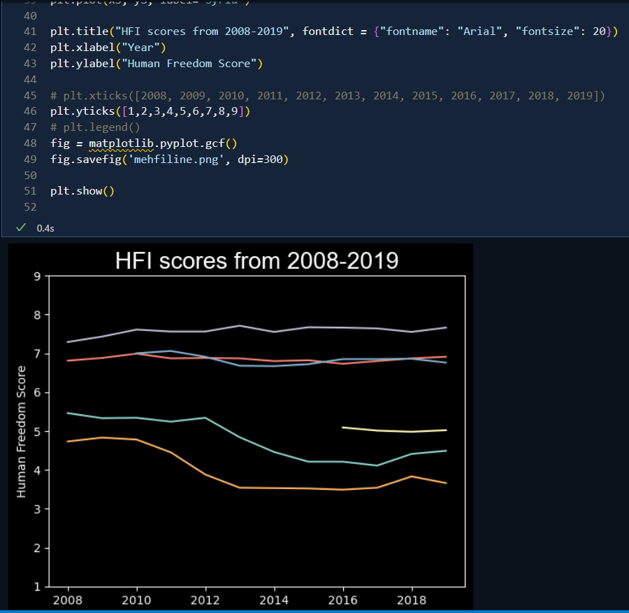
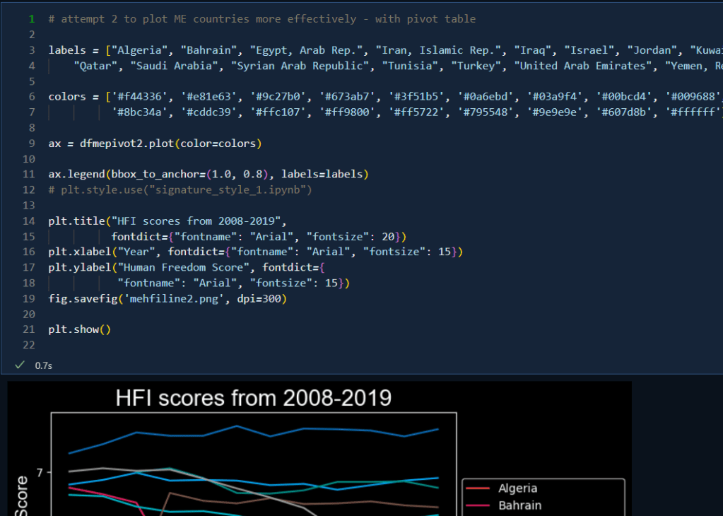
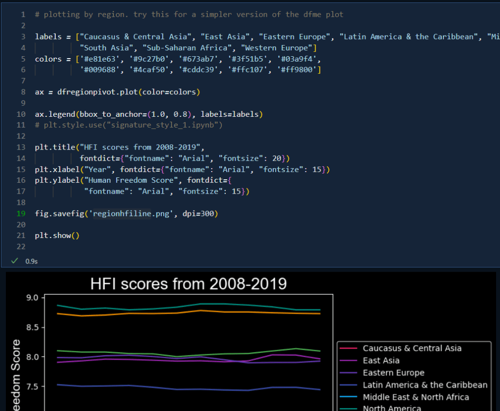
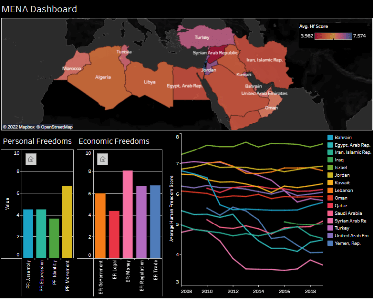
- Summary of findings so far: certain regions generally scored lower than others. Some of those had dramatic outliers that skewed the results slightly (like Syria) but sometimes there were unexpected changes, as in the Middle East where everything in the middle group of scores looked relatively predictable but in fact some countries had dramatically declined and a few have been increasing lately (such as Bahrain and Egypt). Worldwide, there’s a slight freedom index score decrease in recent years but it’s very slight, with some regions (like the Caucasus and Central Asia) improving recently, so I wouldn’t say it’s a trend yet, expect perhaps in the Middle East, but Syria, Yemen, and Turkey skewed those results considerably, and by-and-large, it’s leveled off lately so it’s hard to evaluate with any certainty.
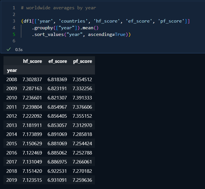
- Then I opened the data in Excel and examined it from a different angle using pivot tables. At first glance, it looks like the worldwide averages have actually improved, but it’s quite evident that this is because there’s more data available for recent years whereas, during the earlier years when they were compiling this data, there are more countries with missing values. This means that using averages rather than the default sums of values seems like a more accurate reflection of the situation.
- Beyond that, the only capabilities in Excel that added value to what I’d already done in Python, beyond the dashboard consolidation, was the graph of personal freedom averages which allowed me to see the variation among specific freedoms within a single region or country (which I could have done in Python) and the easier division of line graphs into specific subregional collections of countries.
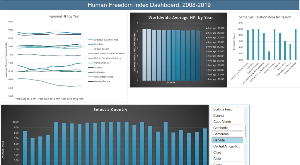
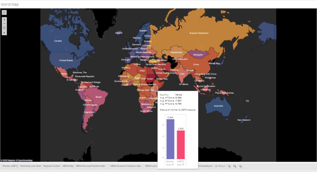
- Then I loaded the csv into Tableau to create a different collection of visualizations. This is a work-in-progress as I explore new-to-me Tableau capabilities, but primarily what I’ve done so far is to replicate the best Python and Excel charts, add maps, and collect them on dashboards. One observation I’ll make as I added a Status of Women & LGBTQ people tooltip to the world map, is that some women and LGBTQ people would probably debate some of the values for certain countries.

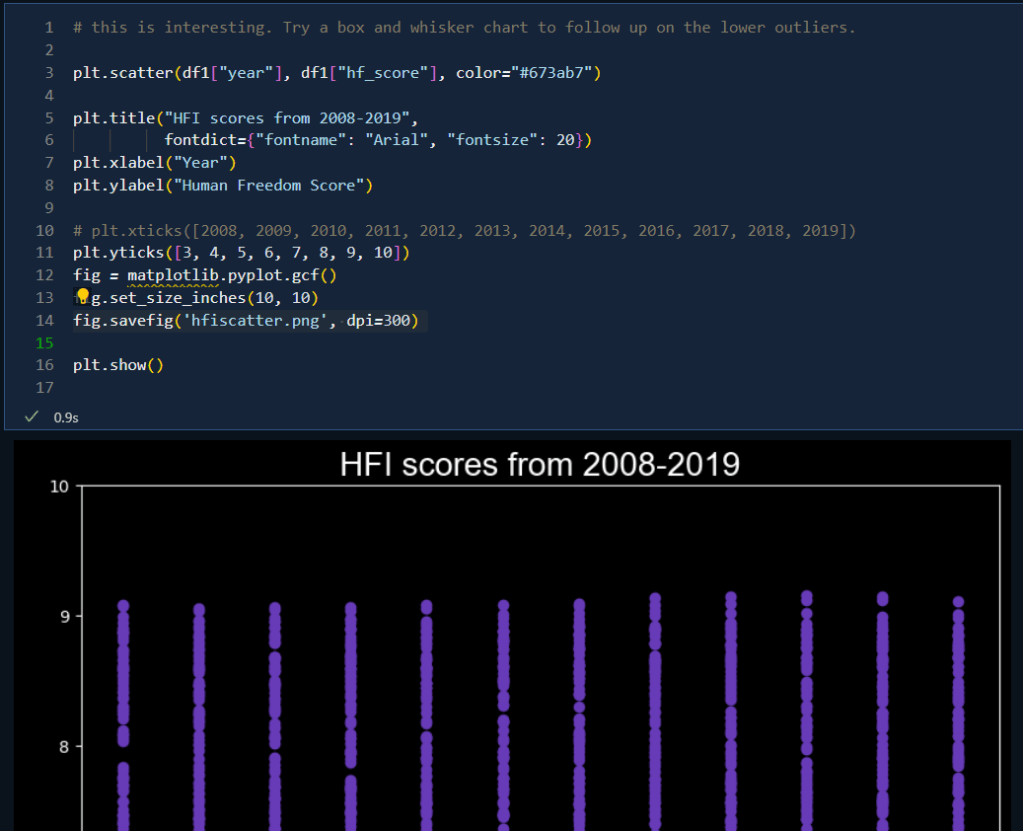
- Finally, I compiled key findings and graphics into a report, linked below:
